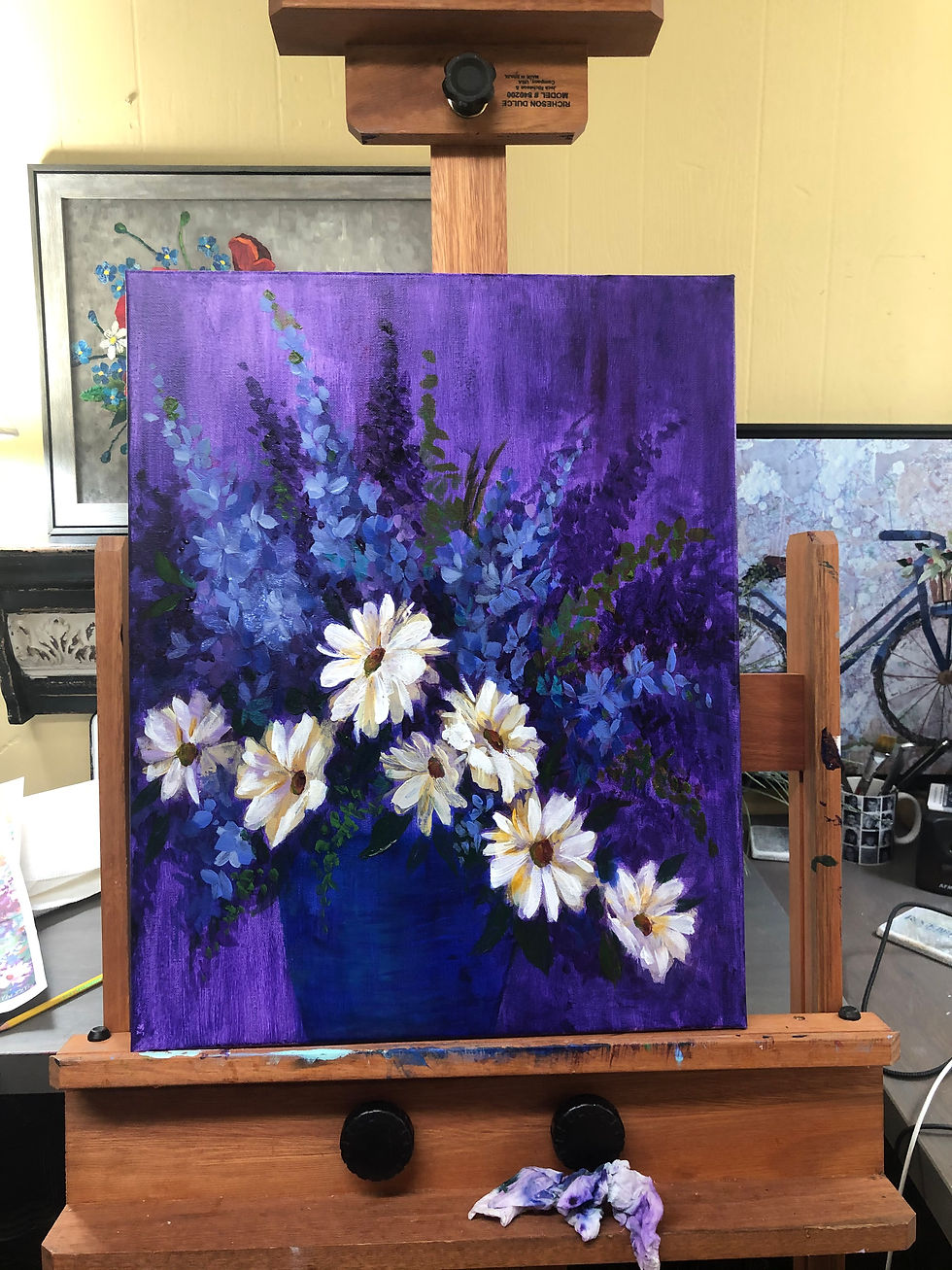
Daisies & Delphs
- Diane O'Connor

- Nov 13, 2020
- 2 min read
Updated: Apr 14, 2024

This fall the colors faded fast, the temperature dipped, and everything became very dark and gray much earlier than usual —it even snowed. I decided to take action! [Of course last week we had 10 days of beautiful Indian summer—I even got my bike back out! But back to my plan . . . .]
This summer I knew I wanted art creation to be part of my rhythm of life, so I've been taking action to make that a reality. On one of the grayest days I discovered Nancy Medina. When her brilliant, cheerful ad popped up on Facebook I signed up for her 5 Free Tips for Acrylics—then I decided to invest in one of her acrylic painting classes.
Wow! I mean look at this beautiful online classroom I've been going to these days—what's not to love?!?!
Every page is a delight to my eyes and I'm picking up lots of great tips. I'd highly recommend Nancy as a teacher. She's inspiring, encouraging, and very clear on what she is doing each step of the way.
I've been using my Masterson Stay Wet Palette which has been wonderful! My acrylics stay usable for over a week! Lately my color choice consists of Permanent Rose, Quinacridone Magenta, Cobalt Violet, Burnt Umber, Cad Red Hue, Cad Yellow Hue, Parchment, Neutral Gray N8, Titanium White, Turquoise, Alizarin Crimson, Quinacridone Nickel Azo Gold, Chromium Oxide Green, Indian Yellow, Yellow Iron Oxide, Ultramarine Blue,
Hookers Green, Green Gold, Light Violet, and Medium Violet. I also use a combination of Winsor & Newton Flow Improver and Winsor & Newton Slow Drying Medium. Using larger brushes helped me paint more loosely.
I've been using a ¾ inch brush (3/4" wide flat Royal Soft Grip SG 700) and a #14 Sableteck.
I started with a wash of Cobalt Violet, and followed Nancy Medina's great directions for painting daisies.

Nancy's painting placed her daisies and delphs in a garden It was lovely but I decided to pluck mine instead and place them in a deep blue vase. I started the underpainting . . . .

Time to block out the delph's. I liked it a lot with the purple background, because I'm a real fan of painting with color families.

But this time I decided to branch out and try a warm background with complimentary colors.

I continued to add details and this looked pretty much complete.

But after looking at it for awhile, I decided that I might want to add some of my mixed media touches. I brought out my stash of painted papers, and tried out some possibilities to see if I would like it. (Learn more about painted papers on a gel plate)

Once I got started I continued to add to my heart's delight. I love adding pieces of paper to add texture and interest. i think it might be my favorite part of designing. From a distance it doesn't took any different, but up close you can see the little touches.

I signed it and then I used a coat of High Gloss Liquitex varnish to bring out the color. Then I followed it with a coat of sprayed acrylic Satin varnish.
I had a white "floater frame" purchased and ready to go.
Ta-da! Here is my completed piece.


Comments